53 Sports Logo Design Inspiration
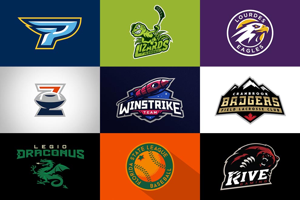
Sports has become very popular entertainment in the past decades. It has been part of our daily lives too. It begun since the ancient times up to this generation and still popular around the world.
Did you notice how you can easily recognize your favorite sports team? There are two major elements that build up the teams identity.
First is the logo or the symbol that speaks about the characteristics of the team itself. While the second element is color which separates the team from the others.
What is the Importance of Sports Logo?
We all know that every professional team in sport have their own unique logos right? This is how you distinguish them from their opponents. You can easily recognize the team with a well designed sports logo.
Your logo is a great way to represent your team and also important part of your team’s branding. Having a significant symbol is like expressing the character and spirit of your team into an icon, emblem or wordmark so it can be memorable to your fans and audiences.
Characteristics of Sports Logo
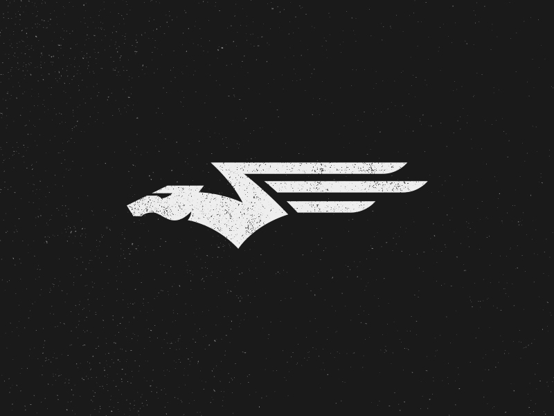
Sports logo should be fun, exciting and energetic! Several teams in sport incorporate animals and mascots to portray energy, power and courageousness. Adding fun and brave colors are excellent complement to these symbols.
Your sports logo should be better presented on jerseys, billboards, promotional materials, on the internet and more so keep in mind to make it bold and recognizable.
Here are set of exciting sports logo design collected from great designers for your inspiration. I categorized them to various types so you can observe the difference.
Animals and Mascots
Traditional Emblem Type
Using Workmark and Monogram
Minimal and Subtle
Related Articles:




























6 Comments
I like the sleek feel of these logos Red. Well done.
Thank you so much Ryan! These are handpicked from great designers. More curated design to come for inspiration. Cheers!
I read your post.really excellent detailed Information.
this is good post..
Thank you Virendra for your kind words! I hope this post brought value to you.
I like the sleek feel of these logos Red. Well done!
Thank you matrix sniper!
Comments are closed.