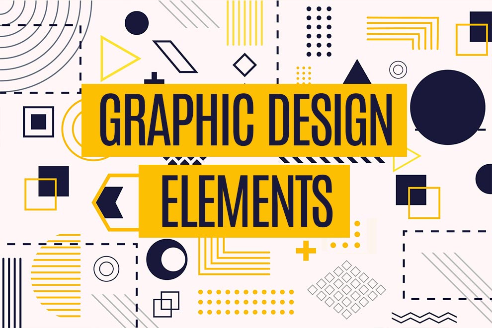
8 Graphic Design Principles for an Effective Design
Graphic design is more than just creating pretty visuals—it’s about communicating messages and evoking emotions through well-crafted compositions. Understanding the core principles of graphic design is crucial for creating impactful designs. Whether you’re a seasoned designer or just starting out, mastering these principles will set you apart. Let’s dive into the fundamental concepts that will elevate your design game!
What’s the Importance Graphic Design Principles?
Understanding the principles of design is like knowing the rules of a game. They provide a framework that guides the creative process, ensuring balance, harmony, and coherence in your work. These principles—such as contrast, alignment, and repetition—are the secret ingredients that make a design not just functional, but also aesthetically pleasing.
Imagine a song without rhythm or a story without structure; design without principles would be just as chaotic. By applying these principles, designers can create works that not only look good but also communicate effectively. They help in organizing elements, creating visual interest, and ultimately making the design resonate with the audience.
1. Balance
Balance refers to the distribution of visual weight within a design. It can be symmetrical (evenly distributed) or asymmetrical (unevenly distributed but still balanced). Achieving balance creates a sense of stability and structure in the design.
2. Contrast
Contrast involves the use of opposing elements (such as light vs. dark, large vs. small, or complementary colors) to create visual interest and draw attention to key areas. Effective use of contrast helps to highlight important information and enhance readability.
3. Hierarchy
Hierarchy is about organizing elements in a way that indicates their importance. This can be achieved through variations in size, color, contrast, and placement to guide the viewer’s eye through the design in a deliberate manner.
4. Alignment
Alignment refers to the positioning of elements in a design relative to each other, creating a visual connection between them. Consistent alignment helps to create a clean, organized, and professional appearance.
5. Emphasis
Emphasis is about creating a focal point in the design, directing the viewer’s attention to the most important element. This can be achieved through size, color, placement, or other distinguishing features.
6. Proportion
Proportion is the relationship between the sizes of different elements within a design. Proper proportion ensures that elements are appropriately sized relative to each other, contributing to a balanced and harmonious composition.
7. Rhythm
Rhythm refers to the repetition or alternation of elements to create a sense of movement and flow within the design. This can be achieved through patterns, sequences, or repeating motifs.
8. Repetition
Repetition involves using the same or similar elements throughout the design to create consistency and unity. This can reinforce a particular theme, idea, or visual style.
How Do Elements and Principles of Graphic Design Correlate?
Elements and principles of graphic design go together like peanut butter and jelly. The elements of graphic design are the basic building blocks: line, shape, color, texture, space, and form. These elements are used by designers to create visual interest. The principles, on the other hand, are the guidelines: balance, contrast, emphasis, movement, pattern, rhythm, and unity. Think of them as the recipe that tells you how to mix those ingredients. When you get the balance right, your design feels harmonious and visually appealing.
Let’s say you’re designing a poster. You start with the elements: bold lines to draw attention, bright colors to convey energy, and varied textures to add depth. Then, you apply the principles: balance the layout to make it pleasing to the eye, use contrast to make important information stand out, and create a rhythm with repeating elements to guide the viewer’s gaze. It’s like orchestrating a symphony where every note and rest has its place, creating a harmonious composition that resonates with the audience.
Conclusion
Incorporating these graphic design principles into your workflow will transform your designs from ordinary to extraordinary. Remember, practice makes perfect! Keep experimenting, learning, and pushing the boundaries of your creativity. Ready to elevate your design skills? Start applying these principles today and watch your designs come to life!