How to Choose the Right Font for Your Project
Fonts can make or break a design. The right typeface can elevate your project, while the wrong choice might ruin the entire aesthetic. So, how do you go about choosing the right font that fits your vision? Let’s walk through a guide on how to choose the best fonts for design projects and what to consider along the way.
1. Understand the Mood and Purpose of Your Project
Before you even start browsing fonts, you need to have a clear understanding of your project’s purpose. What kind of mood are you aiming to create? Whether it’s a bold, serious tone or a playful, modern vibe, the font you choose should align with your design’s overall message.
- Is it professional or casual?: For a corporate presentation, you might lean towards a serif font that feels formal and reliable. In contrast, a playful event flyer might benefit from something more modern and expressive.
- Who is your audience?: Different audiences resonate with different fonts. An audience of tech enthusiasts might appreciate sleek, minimalist typefaces, while an artsy crowd could love something more creative and free-flowing.
Knowing the tone of your project helps narrow down your choices and avoid fonts that clash with the message you’re trying to send.
2. Consider Readability Above All
Fancy fonts might look cool, but readability should be your number one priority. If people can’t easily read the text, they won’t stick around to admire the design.
- Body text vs. display text: When choosing fonts, remember that some are meant for large headings (display fonts), while others work better for longer blocks of text (body fonts). Using a display font for body text could make the content hard to read.
- Font size and spacing: A font might look perfect in a preview but appear cramped or overwhelming when applied to a design. Pay attention to letter spacing and size when testing fonts in your project.
Make sure you pick fonts that are legible across all platforms, whether it’s on mobile, desktop, or print.
3. Pair Fonts Like a Pro
Mixing fonts in a design can bring more depth to your work, but it’s easy to overdo it. The trick is finding fonts that complement each other without clashing.
- Contrast, don’t conflict: When pairing fonts, contrast is key. If your heading uses a bold, modern font, go for a simpler, more understated font for the body text. This creates balance.
- Limit your font usage: Stick to no more than two or three fonts in a single project. Too many fonts can clutter the design and confuse the viewer.
Choosing fonts that play well together can add that extra layer of polish to your design, making it more visually appealing.
4. Test Fonts in Real Context
A font can look great in theory, but how does it actually work when choosing the right font in your project? Test fonts directly in your design to see how they look with the other elements, like images and colors.
- Do a mock-up: Take a portion of your design, insert the fonts you’re considering, and review the result. Sometimes, a font that seemed perfect might feel off when placed in the actual context of your design.
- Test in different sizes: Try the font at different sizes to see how it scales. A font might look amazing at 72pt for a header but might become unreadable at 12pt for body text.
This testing phase ensures that the fonts you pick will work under real conditions and not just in isolation.
5. Align Fonts with Your Brand’s Identity
If you’re working on a branding project, consistency is crucial. The font you choose should reflect the personality of the brand, whether that’s professional, quirky, or somewhere in between.
- Use brand guidelines: Many brands already have specific fonts listed in their guidelines. If you’re working with an established company, make sure to use the approved fonts.
- Consider longevity: While trendy fonts may seem like a good idea now, they can date your design later. It’s better to choose fonts that have a timeless quality, especially for brands that want to project stability.
By aligning your font choices with the brand, you keep everything cohesive and reinforce the brand’s message across all platforms.
6. Think About Accessibility
Choosing fonts isn’t just about aesthetics; it’s also about making your design accessible to everyone. Consider legibility for different vision abilities and the contrast between your text and background.
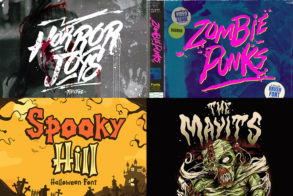
- Avoid overly decorative fonts: Fonts that are too stylized can be hard to read for people with visual impairments. Stick to simpler fonts, especially for body text.
- Check color contrast: Make sure your font color stands out against the background. Low contrast makes reading difficult, particularly for users with color vision deficiencies.
This step is essential in ensuring your design can be appreciated by a wider audience.
7. Explore the Best Fonts for Design Projects
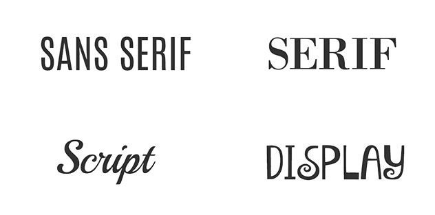
Now that you’ve got the process down, let’s look at some of the best fonts for design projects that work in a variety of settings.
- Sans-serif fonts: Fonts like Helvetica, Arial, and Lato are clean and modern, making them ideal for tech, business, and minimalist designs. They work well for both headlines and body text.
- Serif fonts: If you need something more traditional, fonts like Times New Roman or Georgia offer that classic, professional feel. These are often used for more formal or academic projects.
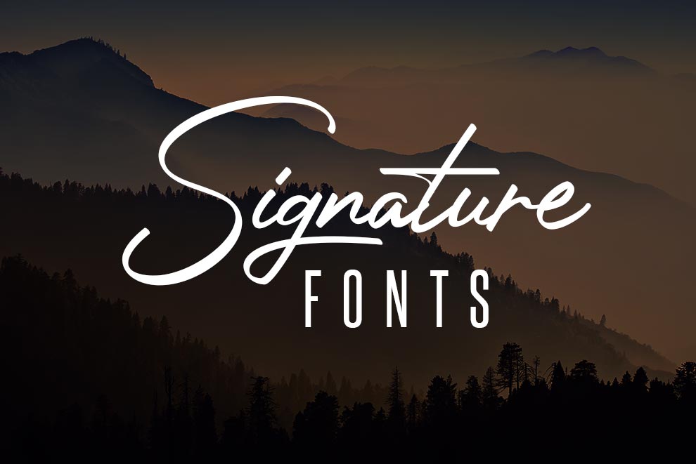
- Script fonts: For a more creative, elegant touch, script fonts like Lobster or Pacifico can add personality to your design. Be careful not to overuse them, as they can become overwhelming in large amounts of text.
- Display fonts: If you want your headlines to pop, fonts like Impact or Bebas Neue are great choices. These fonts are bold and eye-catching, perfect for grabbing attention.
No matter the project, there’s a font out there that will fit perfectly—if you know how to look.
8. Where to Find High-Quality Fonts
Choosing the right font is one thing, but finding it can be a different story. Fortunately, there are plenty of resources online to discover high-quality fonts.
- Google Fonts: A great free resource with hundreds of fonts that are easy to integrate into web projects.
- Adobe Fonts: For Creative Cloud users, Adobe Fonts offers a wide selection of professional-quality fonts that can be used across various design tools.
- Font Squirrel: If you’re looking for high-quality, free fonts, Font Squirrel is a fantastic place to start.
- Envato Elements: For premium, designer fonts, Envato Elements offers a broad selection of fonts you can purchase and use for any project.
These resources will help you quickly find the right font without having to dig through a sea of options.
9. Trust Your Gut, But Keep Learning
When choosing fonts, trust your instincts. If a font feels right for your project, it probably is. That said, never stop experimenting. Keep testing new fonts, learning about typography trends, and refining your skills.
- Stay current: Follow typography blogs, subscribe to design newsletters, and keep an eye on popular fonts in the design world.
- Experiment fearlessly: Don’t be afraid to step outside your comfort zone. Trying out new fonts and combinations can lead to surprising, effective results.
As long as you remain curious and open to learning, your typography skills will continue to evolve.
Conclusion
Choosing the right font for your design projects is more than just picking something that looks good. It’s about understanding the mood, purpose, and readability of your text while keeping your audience in mind. Whether you’re looking for the best fonts for design projects or figuring out how to pair fonts effectively, the right choice can transform your work. Trust your instincts, test your fonts, and always keep learning to master this essential aspect of design.
By following these steps, you’ll have all the tools you need to make smart font choices that take your projects to the next level.


