6 Basic Principles of Good Logo Design

Do you want your logo to look good? Then follow the basics of logo design principles. This will help you throughout the process that leads to success.
Logo comes in different types but it is basically the face of your company or organization.
When people see your logo, this will trigger their minds thinking about your products or services.
Here are the list of six basic principles of good logo design the can help you in your logo project.
1. Keep it simple.
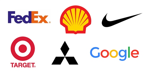
Complicated logo is not really bad, it becomes bad when people takes too much time understanding it. It is important that your logo is memorable and recognizable. That’s why making it simple is an important rule.
There are so many famous logo yet the design is simple. Simplicity makes the logo aesthetically easier to see and cleaner for consumers to digest. Keep the color of your logo to not more than three.
2. It should be practical and scalable.
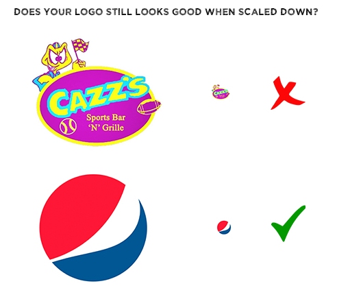
A good logo should work in any size and color. It should be flexible in all types of media such as large billboard or a small business card.
Make sure that the logo looks good when scaled into tiny icon or resized for big banners . You can try to cut a logo into half but still recognizable to people then you’ve done a great job.
You should know that your logo is in vector format when you submit to your client. It doesn’t mean that you should start creating your logo right away in Illustrator or any vector program rather it only means at the end stage, your client should get the vector format.
Why vector format? vector has an attribute that allows you to scale shapes infinitely without losing any quality. A good logo should not lose its quality when being scaled to make it effective and functional.
Related Article: 100+ Single Letter Logo Design from A to Z
3. It must be functional and recognizable.
Functionality is another key attribute of a good logo design. It must work well with your clients company like for example in their business cards or website.
A good logo is actually telling a story about a company and s really acting like a logo.
There are a lot of cool logos in the market but do they really work well with their company so they get as many customers they want.
Related Article: 53 Sports Logo Design Inspiration
As a designer, we want to make a good logo design for your client so they benefit from their business. Make sure that your logo is functional that people can see it understand it and notice it right away is very important.
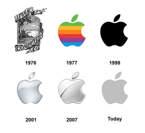
Our job as a logo designer is to make a company more money. In terms of branding, like apple, when people is the logo of an apple the recognize it and makes them want to buy their products.
So it’s important to create a logo that is functional and works well with that client.
4. Legibility is a key!
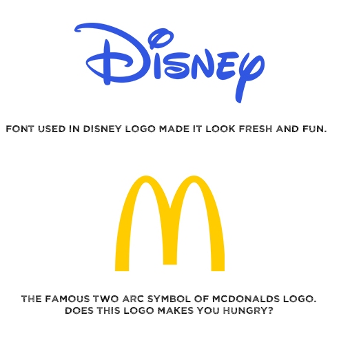
When creating a logo, specially a logo type which is a wordmark, then it should be readable. It’s okay to be creative in designing a logo type, but the creativity side of it is making it fun yet legible.

5. Platform compatibility.
This rule is quite new in the past decades regarding a good logo design. Years ago, companies only have shops, business cards and products where they place logos. Now in the modern days, there are a lot of platforms that a logo is integrated.
This is something that is very new in the past ten years its its very important to look out in your logo. Its no longer good enough that your logo works on a business card but also in a computer or a small smart phone or a website header.
Related Article: 25 Creative Bird Logo Design Inspiration
When creating an iconography type of logo design, make sure that it works well and noticeable in a size of an app icon in real life.
In the application era, large amount of consumers uses smart phones and iphones in the market so it is important that your logo icon can compete with other icons.
It is probably what people look at in the app market at first so it’s important to be noticeable and looks good.

6. Memorable and timeless.
Trends come and go but a good logo should be effective as the year goes by. This is the quality that makes your logo easy for customers to recall which encourages customers to come back.
Related article: 30 Clever Logos with Double Meaning.
Simplicity usually makes your memorable logo. But also putting something unique in your can make it unexpectedly memorable and stand out from the pack and stand for decades or even centuries.
Conclusion
We can create any logo we want depending on the requirements. At the end of the day, we can come up with our desired output or vice-versa.
Keeping in mind these basic principles of a good logo design will help you get the job done correctly!
Related Articles:


